
Midtherm is a longstanding British manufacturer with over 50 years’ experience in designing and manufacturing domestic and commercial flues and an array of associated products. Operating out of the group’s Dudley-base in the heart of the West Midlands, the group distributes countrywide and also exports overseas.
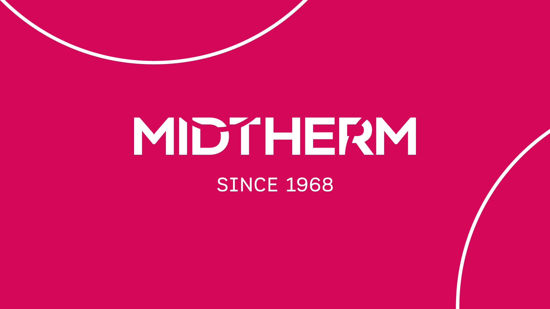
A future-facing brand mark
Our objectives were to retain Midtherm’s heritage and craftsmanship, whilst also modernising the brand look and feel, supported by strong messaging for the digital age and customers of today.
Concept: Flow
Flue systems work with a constant flow of extraction, channelling the air out of a building. Our design team referenced this by taking the circle shape used in flues and incorporating it subtly into the brand marque. Two circles, representing the shape of the flue, bisect a strong sans serif typeface. A bold rhodamine red completes the logo.
Mark Jones, Director of Sales & Marketing at Midtherm, says: “When taking a well established traditional family-owned business and trying to develop a brand fit for the next 50 years, there are many aspects to consider, from demonstrating we can meet expectations of today whilst also relaying our core beliefs and traditions.
“On recommendation, we engaged The Unknown Creative for our rebrand and group websites project. John, Vicky, and the team worked closely with us to understand our strategic intent, and the team created our incredible new logo – with all elements coming together to represent Midtherm’s strengths and values of passion, warmth, and product.”
The project rolls out with websites for the Midtherm group of companies.
Visit our portfolio to view designs for Midtherm and other projects.