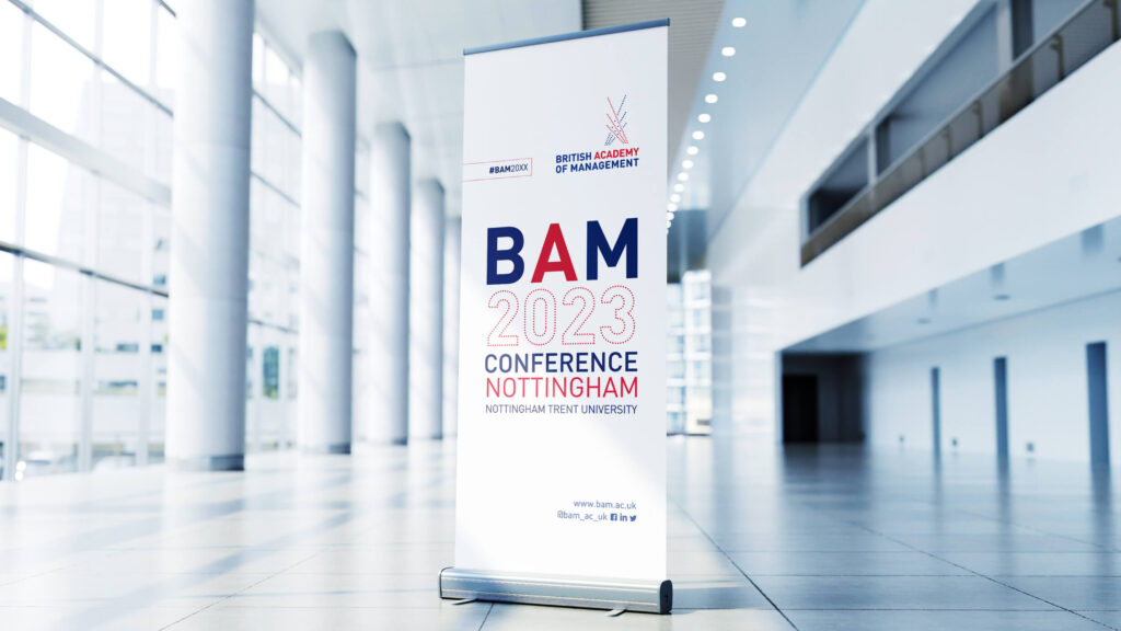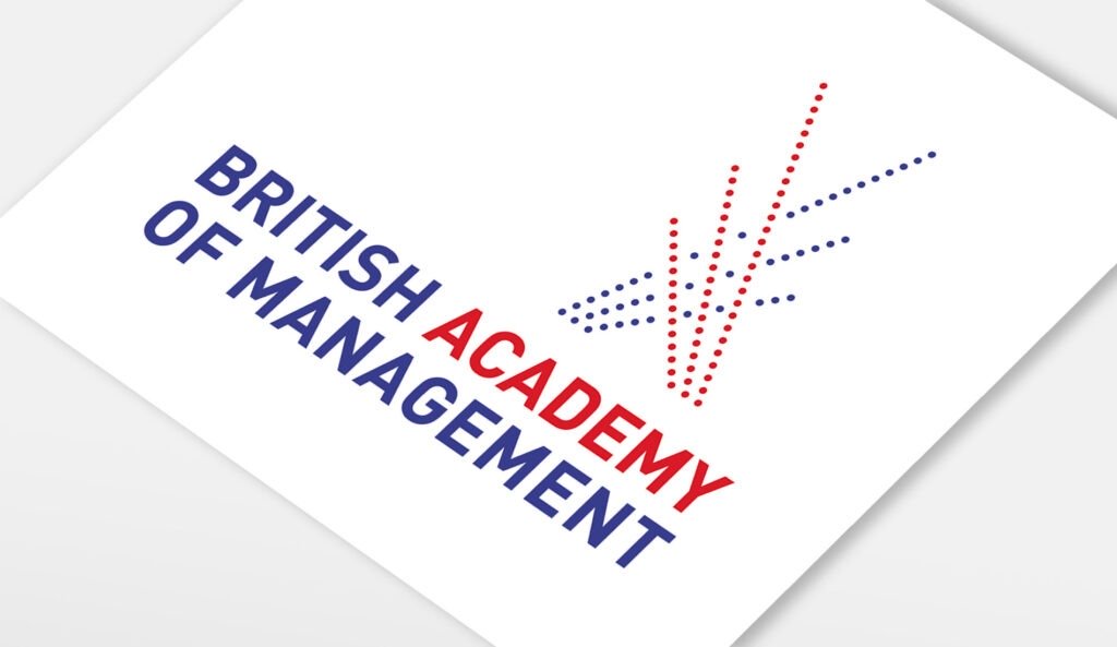
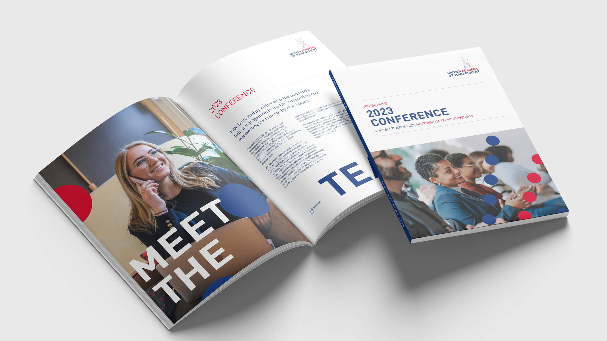
Fresh new brand mark
The original logo served BAM very well, however after 20 years it was time for change for this forward-thinking organisation. Our brief was simple – to create a fresh new brand mark to take the organisation forward and to raise their profile internationally. We chose a clean, modern typeface (Din) and positioned the words on two lines at equal height; emphasising the keyword ‘Academy’ in brand red.